The purpose of this project was to give some background on our families through old photos or meaningful items passed down from generations that represent our heritage.
Grandparent’s Wedding
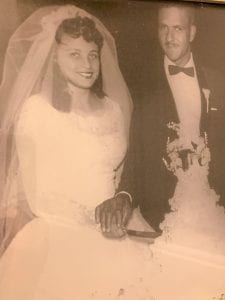
This is a photo of when my grandparents got married in 1960. This photo means a lot to my family, especially since they are still married today. I went to my grandparent’s house and they have this photo on one of their shelves in their livingroom, so I thought it would be perfect for this project.
Parent’s Wedding
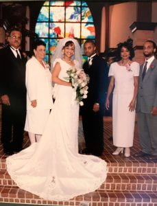
This is a photo of when my parents got married in 1999. On the left of my mom are her parents, who are from the first image, and on the right are my dad’s parents. I thought this picture was perfect to use because it shows how the two families came together on my parent’s wedding day. My family is very important to me, and this photo represents how it all started.
French Sign

This sign hangs above the bathroom in my house, and it actually used to be in my mom’s home when she was little. My mom’s side of the family is French, and the sign means “bathroom” in French. I thought this would represent our French culture, from my mom’s side of the family, which is why I used this image.
Bob Marley
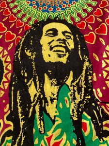
This is a poster of Bob Marley that I got for my dad for his birthday a year ago, and it represents our Jamaican culture. Both of my dad’s parents were born in Jamaica, and we really love the culture and music. My dad loves Bob Marley, and this was a very meaningful gift for him that he loved, since he is very in touch with his culture.
Mother Mary
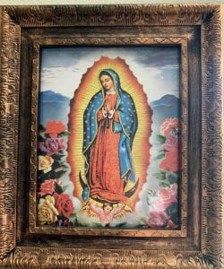
This is a photo of Mary that my grandpa actually gave to me, and it represents our Catholic faith. I have grown up Catholic my whole life and our faith is really important to me and my family. We also attend the same church that my mom grew up in as a child. This is also very meaningful to me since it was gifted to me by my grandpa and it is something I can keep forever.
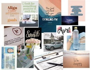
 Glorifying Everyday
 Ugly Beautiful
 I thought Zadrian Blache’s ugly beautiful image was very successful. I also found it really cool how the ugly subject was directly in the space between the bars. I liked how he decided to change the photo to black and white, and I definitely think it made the photo more interesting.


 This was from our removing backgrounds project, and I liked how we were able to place the little box person into another image however we wanted to. I enjoyed being able to choose the background and learning how to cut out the box image to put it into a different picture.
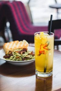 The fish in iced tea was a really cool project that I enjoyed a lot, and I thought it was cool how we were able to make it look like the fish was actually in the drink. Also, i learned a lot about the filters and how to be able to make the fish blend in with the drink.
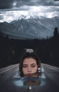 This was from our blended project. This was really cool to work on because we were able to give the illusion that the woman in the water was fading into the road. This was a project that took more time to actually blend the water into the road, but it was really fun to work on.
 This was from our text portrait project, and I thought it was cool how we were able to make the words have the picture as the background. Also, I am glad that I learned this skill so that I can now do this with any picture and quote.
 This was from our blemishes project. I found this project really cool because of how easy it was to remove blemishes from her face. I didn’t expect this skill to be as easy as it was, so it’s cool that I know how to use it now.

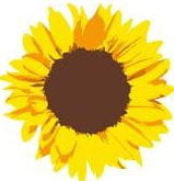
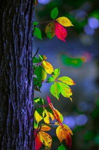 This photo really stood out to me because of the vibrant colors of the leaves. I also really like the image because I enjoy nature and the pretty colors that you often see. The photo has a very aesthetically pleasing color harmony because of how well the colors go together. There are two primary colors in the image, which are yellow and red. The tertiary colors, yellow and green, match very well together on the leaves. Not many colors were incorporated into the image, but the combination of green, yellow, and red blended in very nice. The color green often means growth and freshness, which relates to the image very well. Yellow often symbolizes happiness and positivity. The color red has a meaning that includes life and health. Also, I really like that the different colors on the leaves make the image pop. This photo gives me a sense of calmness because of the warm colors that were incorporated.